Working with Coffee and Tea Stains for Vintage Effects

Have you ever looked at a piece of bright, pristine white paper and felt a sudden wave of intimidation because it looked too "perfect" to touch? Using coffee and tea stains is one of the most effective ways to break that perfectionism by introducing organic, unpredictable textures that immediately age your paper. This post covers the practical methods for using brewed liquids to create vintage backgrounds, how to control the intensity of the stains, and how to layer these organic textures with other mixed-media elements without ruining your surfaces.
The Benefits of Using Organic Stains
Using coffee or tea instead of commercial "distressing" liquids offers a level of nuance that synthetic dyes often lack. Because these are organic materials, they react differently to the fibers of the paper, creating subtle gradations of color and unexpected "blooms" where the liquid dries. This technique is particularly useful for art journaling when you want to create a sense of history or a weathered look that feels lived-in rather than manufactured.
Beyond the aesthetic, using these materials encourages a mindset of experimentation. You cannot fully control where a drop of tea lands or how a coffee ring settles, which forces you to lean into the "ugly" or unpredictable stages of the process. This is a vital part of a healthy creative practice—learning to work with what happens rather than fighting against it.
Choosing Your Liquids and Tools
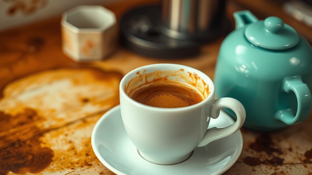
Not all brewed liquids are created equal, and the type you choose will dictate the final color temperature of your work. For a warm, sepia-toned vintage look, reach for black tea or highly concentrated instant coffee. For a more subtle, yellowish parchment effect, green tea or a lighter herbal tea works best.
- Black Tea: Provides a reliable, mid-tone tan. It is excellent for creating consistent washes.
- Instant Coffee: This is your best tool for high contrast. Because you can control the concentration by adding more powder to less water, you can create anything from a pale cream to a deep, dark espresso brown.
- Green or Herbal Tea: These offer a cooler, more muted tone that works well if you want to avoid the heavy warmth of traditional sepia.
- The "Stronger the Better" Rule: If you want a stain to show up on heavy watercolor paper or thick mixed-media paper, you must brew your liquid much stronger than you would drink it. A weak tea wash will often disappear once the paper dries.
For application, you will need more than just a standard paintbrush. While a wide 1-inch flat brush is good for large washes, you should also gather items that create texture. Old sponges, crumpled pieces of paper, or even a sea sponge can help lift or deposit liquid unevenly to create more visual interest.
Technique 1: The Full Surface Wash
The full surface wash is the most common method for aging an entire sheet of paper. This is ideal when you want to create a "blank slate" that feels like an antique document before you begin your actual painting or collage.
- Prepare your workspace: Lay down a plastic sheet or a heavy-duty silicone mat. Coffee and tea will stain wooden tables or fabric surfaces instantly.
- Wet the paper: Use a spray bottle with plain water to lightly mist your paper. This helps the pigment spread more evenly and prevents harsh, jagged edges from forming at the perimeter.
- Apply the liquid: Use a large brush or a sponge to apply your brewed liquid in sweeping motions. Don't be afraid to go heavy in some areas and light in others.
- Dry the paper: You can let it air dry, but for faster results, use a hair dryer on a low, warm setting. Be careful not to blow the liquid around too much, or you will lose the control over your shapes.
If you find that the paper is buckling or warping due to the moisture, this is a great time to practice creating immersive gesso reliefs once the paper is dry. The gesso will help flatten the sheet and provide a new, textured surface to work on.
Technique 2: Controlled Splatters and Rings
If you want to create a more "distressed" or "accidental" look, you should move away from controlled washes and toward splatters and rings. This method creates a sense of movement and organic chaos that is perfect for a messy, vulnerable journaling session.
To create rings, dip the bottom of a small glass or a bottle cap into your concentrated coffee and press it directly onto the paper. This creates a perfect circle with a dark outer rim and a lighter center, mimicking the look of a coffee cup left on a manuscript. To create splatters, dip a stiff-bristled brush (like an old toothbrush or a heavy watercolor brush) into the liquid, hold it a few inches above your paper, and flick the bristles with your finger.
This technique works exceptionally well when layered with found objects and forgotten textures. For example, you can lay a piece of lace or a dried leaf on your paper, splatter coffee over it, and then lift the object to reveal the silhouette underneath. This creates a ghostly, layered effect that adds depth to your art journal pages.
Managing Color and Layering
One mistake many artists make is trying to paint over a coffee stain with light colors immediately. Because coffee and tea are essentially stains, they can "bleed" into your wet paint if you aren't careful. If you are working with watercolors or thin acrylic washes, the coffee stain will likely react and blend with your new colors.
To prevent this, allow your coffee stains to dry completely. If you want to paint a specific shape or design over the stained area, use opaque media like heavy-body acrylics, gouache, or oil pastels. These will sit on top of the stain rather than mixing with it. If you prefer working with transparent media, you must use a "dry" technique—apply your paint with a very dry brush or use a sealant to lock the stain in place before continuing.
Troubleshooting Common Issues
Problem: The color is too light.
Solution: This is usually caused by a lack of pigment density. Next time, use less water and more coffee/tea powder. You can also layer your stains. Apply one wash, let it dry completely, and then apply a second or third wash to build up the depth of color.
Problem: The paper is curling excessively.
Solution: This happens when the paper absorbs too much moisture in one spot. To minimize this, use a spray bottle to dampen the entire sheet first, and try to work more quickly with a larger volume of liquid rather than many small, wet applications. Once the paper is dry, you can place it under a heavy stack of books to flatten it.
Problem: The edges are too harsh.
Solution: If you see a dark "tide line" at the edge of your wash, it means the liquid dried too quickly. To prevent this, dampen the edges of the paper with plain water before you start your wash. This creates a buffer zone that allows the color to fade out softly rather than stopping abruptly.
Incorporating Stains into Your Mixed Media Practice
Once you have mastered the basic stain, start thinking about how it interacts with your other tools. A coffee-stained background is a perfect foundation for more sculptural elements. You can use the dark, organic tones of the coffee to highlight the edges of a textured gesso piece or to provide a "gritty" background for a collage of vintage ephemera.
Don't be afraid to mix your coffee with other liquids. Adding a drop of black ink or a bit of liquid acrylic ink to your coffee can create much more dramatic, high-contrast results. This is where the "messy" part of the practice becomes truly rewarding—when you stop trying to make a "pretty" watercolor painting and start making a textured, layered piece of history.
Remember, the goal isn't to create a perfect piece of art. The goal is to use these humble, everyday materials to create a space where you can express yourself without the fear of making a mistake. A coffee stain is, by definition, a beautiful mistake. Embrace it.