Stop Using Only Black for Your Shadows

Quick Tip
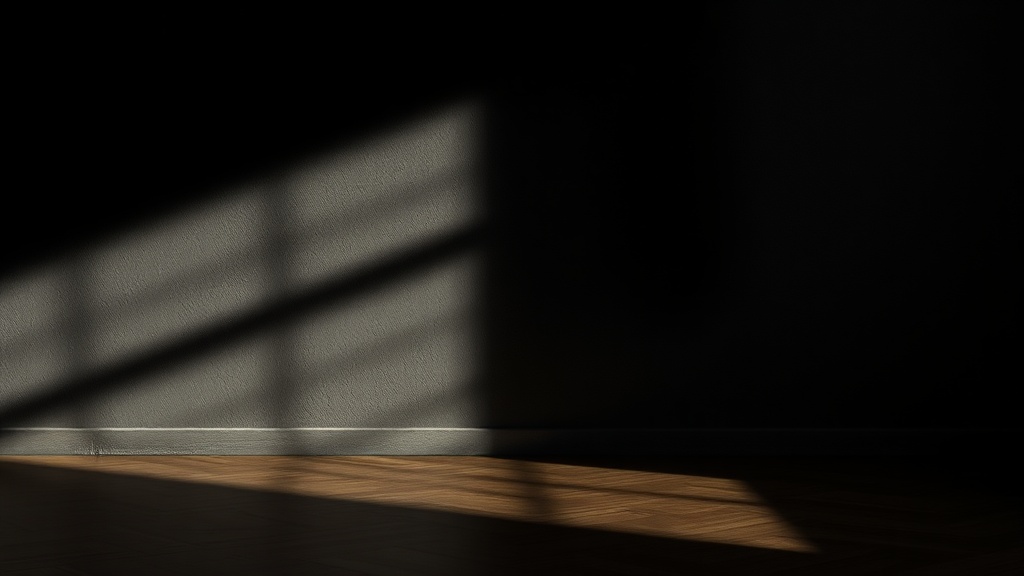
Use deep blues, purples, or complementary colors to create shadows that feel atmospheric and vibrant.
A painter sits before a canvas, adding a deep shadow to a painted petal. They reach for the tube of Ivory Black, squeeze a dollop onto the palette, and stroke it into the crevice. Suddenly, the vibrant flower looks heavy, bruised, and disconnected from the rest of the composition. This happens because black pigment often lacks the transparency and temperature of the surrounding colors, creating a "dead" spot in the art.
Learning to mix shadows with color instead of pure black will instantly add depth, vibration, and life to your mixed-media work. When you rely solely on black, you lose the nuance of light and the atmospheric quality of your piece. Instead of a flat void, your shadows should feel like a part of the world you are creating.
Try Complementary Colors
One of the most effective ways to create a natural shadow is to use the color opposite your subject on the color wheel. This technique creates a sense of "visual tension" that looks much more professional than a simple dark stroke.
- For Yellow Flowers: Instead of black, use a deep Ultramarine Blue or a violet. This creates a rich, luminous shadow that feels organic.
- For Red Elements: Try a dark Phthalo Green or a deep teal. The subtle green undertone makes the red pop without looking harsh.
- For Warm Landscapes: Use a burnt sienna or a deep ochre mixed with a touch of indigo to ground your light yellows and oranges.
Use Transparent Tints and Glazes
In art journaling, we often layer materials like watercolor, ink, or watered-down acrylics. If you want a shadow that feels integrated rather than slapped on, use a glaze. A glaze is a thin, transparent layer of color that allows the texture underneath to show through.
If you find that your colors look flat or muddy, you might be experiencing graphite sketches looking flat due to heavy-handed shading. To avoid this, try mixing a highly pigmented color like Alizarin Crimson with a lot of water or a glazing medium. This creates a "tinted shadow" that maintains the light's energy while providing the necessary depth.
The "Dark Neutral" Approach
If you aren't ready to jump straight into color theory, move toward "chromatic blacks." Instead of reaching for the black tube, mix two dark colors together to create a custom shadow. This keeps your palette cohesive and prevents the "ugly" or "dirty" look that often comes from overusing black paint.
- The Blue-Brown Mix: Mix Burnt Umber with Prussian Blue. This creates a sophisticated, near-black that feels much more alive than standard black.
- The Deep Purple: Mix a dark Payne's Gray with a touch of Magenta. This works beautifully for shadows in organic shapes like leaves or fabric.
The next time you feel the urge to reach for the black, pause. Ask yourself: What color is actually hiding in the shadow? Experimenting with these darker, colored tones is a great way to embrace the messy, imperfect process of learning color harmony.