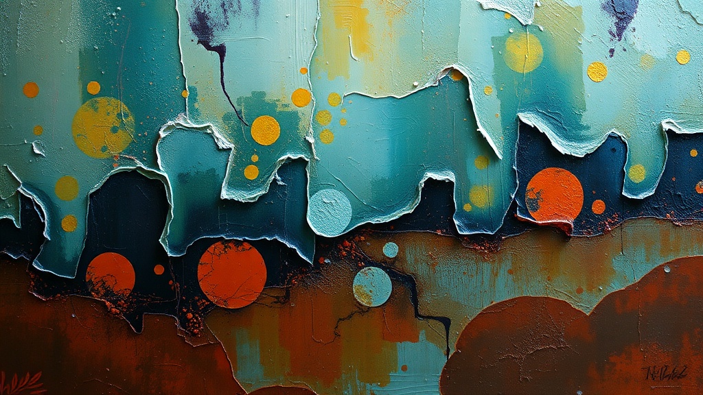
Creating Depth with Layered Textures and Transparent Glazes

Imagine staring at a page that feels flat, heavy, and strangely uninspired. You’ve applied the paint, but it just sits on the surface like a sticker rather than becoming part of the paper. This post covers how to build physical and visual depth using layered textures and transparent glazes. We’ll look at how to move beyond flat color to create work that feels dimensional, alive, and deeply personal.
Depth isn't just about making things look "3D." It’s about creating a sense of history on your page. When you layer, you’re telling a story where one thought sits beneath another—sometimes partially hidden, sometimes glowing through. It's a way to embrace the mess instead of fearing it.
What are transparent glazes in mixed media?
Transparent glazes are thin, translucent layers of color or medium that allow the layers underneath to remain visible. Unlike opaque paint, which hides everything it covers, a glaze acts like a tinted window. You might use a highly diluted acrylic wash, a transparent ink, or a professional-grade medium like Winsor & Newton watercolors or oils to achieve this effect.
The magic happens when you realize that color isn't just a single step. You can layer a thin, watery blue over a dried yellow to create a soft, glowing green that looks much more complex than if you had just mixed the two colors on a palette. This is the secret to making your art feel "lit from within."
Common Glazing Materials:
- Acrylic Ink: Brands like Liquitex make highly pigmented inks that are perfect for thin, vibrant layers.
- Watercolor: The natural transparency of watercolor makes it a go-to for soft, dreamy glazes.
- Gel Mediums: Adding a clear gloss or matte gel to your paint thins the opacity without losing the pigment's strength.
- Alcohol Inks: These are incredibly fast-drying and offer a level of translucency that is hard to match with standard acrylics.
Don't worry about being perfect here. In fact, if a glaze looks a little "muddy" or uneven, let it be. That's part of the texture. If you find yourself getting stuck on a page that won't cooperate, remember my post on why your sketchbook feels like a chore—sometimes the solution isn't more "correct" technique, but more permission to play.
How do I create physical texture on my page?
Physical texture is created by adding actual volume to your surface using thick mediums, found objects, or heavy-bodied paints. Instead of just using color to imply shape, you are actually changing the topography of your art journal. This adds a tactile element that makes the viewer want to reach out and touch the page.
You can start small. A little bit of modeling paste here, a scrap of tissue paper there. The goal isn't to make a sculpture, but to give your background something to "hold" onto. This creates shadows and highlights that change as you move the page under different light sources.
| Texture Type | Material Example | Effect Created |
|---|---|---|
| Smooth/Glossy | Gloss Gel Medium | Adds shine and a "wet" look that catches light. |
| Gritty/Rough | Modeling Paste or Sand | Creates a stone-like or weathered surface. |
| Organic/Crinkled | Tissue Paper or Fabric | Adds soft, uneven ridges and shadows. |
| Structural | Found Objects | Adds literal 3D elements (beads, thread, etc.). |
If you're feeling hesitant about adding "stuff" to your art, try starting with ways to use found objects. It's much easier to start with a piece of junk than it is to build a mountain of paste from scratch. (And honestly, the junk usually looks cooler anyway.)
The "Build and Reveal" Method
One of my favorite ways to work is the build-and-reveal method. You build up a heavy, textured layer first—maybe using a heavy-body acrylic or a thick paste—and then you "reveal" parts of it through glazing or scraping. It’s a way of working with the "ugly" parts of the process. You make something messy, and then you find the beauty within it.
Here is a quick way to practice this:
- Apply a thick layer of modeling paste or heavy-body paint to a section of your page.
- While it's wet, press a textured object (like a piece of bubble wrap or a crumpled paper bag) into it.
- Let it dry completely (this is the hardest part—wait for it!).
- Once dry, use a dry brush with very little paint to "skim" over the high points, or use a transparent glaze to settle into the low points.
How can I layer colors without making them look muddy?
To avoid muddy colors, you must ensure that each layer is completely dry before applying the next, and you should use transparent mediums rather than opaque ones. Mud happens when you mix too many opaque colors together or when you apply wet-on-wet layers that "smush" the pigments into a single, dull grey or brown.
Think of it like stacking sheets of colored glass. If you stack a red sheet over a blue sheet, you get a deep, luminous purple. But if you take a bucket of red and blue paint and stir them together on the page, you just get a flat, muddy mess. The key is the transparency of the medium.
The Golden Rules of Layering:
- Dryness is Non-Negotiable: If you apply a wet glaze over a wet layer, the colors will blend into a single, unreadable sludge. Use a hairdryer if you're impatient.
- Watch Your Pigment: Some colors are naturally more transparent than others. For example, Phthalo Blue is incredibly transparent, while Cadmium Red is quite opaque. Use this to your advantage.
- The "Less is More" Rule: It's better to do five very thin, transparent layers than one thick, heavy layer. Thin layers build depth; thick layers build opacity.
- Check Your Light: Hold your work up to a window frequently. See how the light hits the layers. This helps you see if the colors are actually building or just getting darker.
That said, don't be afraid to break these rules occasionally. Sometimes, a thick, "wrong" layer of paint is exactly what your page needs to break out of a rut. If you're overthinking the science of color, you might be missing the soul of the art. If you find yourself stuck in a perfectionist spiral, check out my thoughts on why you should embrace imperfect lines. It's the same energy—permission to be messy.
When you're working with glazes, you're essentially working with light. You're deciding how much of the past you want to show and how much you want to hide. It's a beautiful, slow process. It requires you to sit with the "in-between" stages where the page looks a bit weird or unfinished. But that's where the real magic lives.
Grab your palette knives, your watered-down inks, and your weirdest scraps of paper. Start building. Start hiding. Start revealing. The depth you're looking for isn't something you can just paint on top—it's something you have to build from the ground up.