7 Ways to Use Old Magazines for Collage

Pulling Color Palettes from Images
Creating Abstract Textures with Torn Edges
Using Typography as a Graphic Element
Building Depth with Transparent Overlays
The Surrealist Cut-and-Paste Method
Blending Photography with Hand-Drawn Elements
Scaling Down for Miniature Journaling
In this post, you will learn seven practical and creative ways to repurpose old magazines into meaningful elements for your art journals and mixed-media pieces. Using magazine scraps is more than just a way to recycle; it is a method to bypass the "blank page syndrome" by using existing imagery to spark new ideas. Whether you are looking to build texture, create color palettes, or build complex layered compositions, these techniques will help you move past the fear of making something "perfect" and toward a more intuitive, messy, and honest creative practice.
1. Creating Color Palettes and Mood Boards
One of the most effective ways to use a magazine is not for the specific images, but for the color stories they contain. Instead of searching for a specific object, look for spreads that feature a cohesive color scheme. A fashion magazine might offer a striking gradient of sunset oranges and deep magenes, while a travel magazine could provide a calming palette of sage greens and sandy beiges.
To use this technique, cut out large blocks of solid color or high-texture areas that don't necessarily have a defined subject. These "color chunks" can be glued into your journal to serve as a background for a future painting or to set the mood for a specific entry. This is a great way to practice color theory without the pressure of painting a perfect gradient yourself. If you find that your colors are feeling a bit dull, you can layer these magazine color blocks under transparent layers of watercolor or even coffee and tea stains to add depth and a sense of age to the hues.
2. Building Textural Backgrounds with Torn Paper
Perfect edges often feel too formal and restrictive for a raw, expressive journal. Instead of using precision scissors, try tearing your magazine pages by hand. Tearing creates a white, fibrous edge that adds a tactile, organic quality to your work. This technique is particularly useful when you want to build up layers of "visual noise" before you start your actual drawing or painting.
Try layering torn scraps of different paper weights and finishes. A glossy page from a high-end lifestyle magazine provides a stark contrast when placed next to a matte, dull page from a newsprint-style publication. You can stack these torn pieces to create a "collage base" and then work over them with acrylic paint, gesso, or even heavy modeling paste. The varying textures of the torn edges will catch the light differently, adding a sense of dimension to your flat journal pages. For more ideas on building physical depth, explore how to use found objects and forgotten textures to elevate your mixed-media surfaces.
3. Using Typography and Text as Graphic Elements
Words carry weight, both literally and metaphorically. Magazines are goldmines for interesting typography, ranging from bold, sans-serif headlines to elegant, thin serif fonts. You can use these snippets of text to add a narrative layer to your art or to simply use them as graphic shapes.
When selecting text, look for more than just the words themselves; look at the layout. A single, large letter can become a focal point, or a block of small, dense text can function as a textured gray shape from a distance. You might choose to:
- Obscure the meaning: Glue down a block of text and then paint over it with watered-down acrylic or ink, leaving only hints of the words visible. This is a great way to practice "hidden" journaling where the emotion is present but the literal words are private.
- Create a focal point: Cut out a single, powerful word that resonates with your current state of mind and place it in the center of a composition.
- Use text as a border: String together small snippets of words to create a frame around a central image or a blank space.
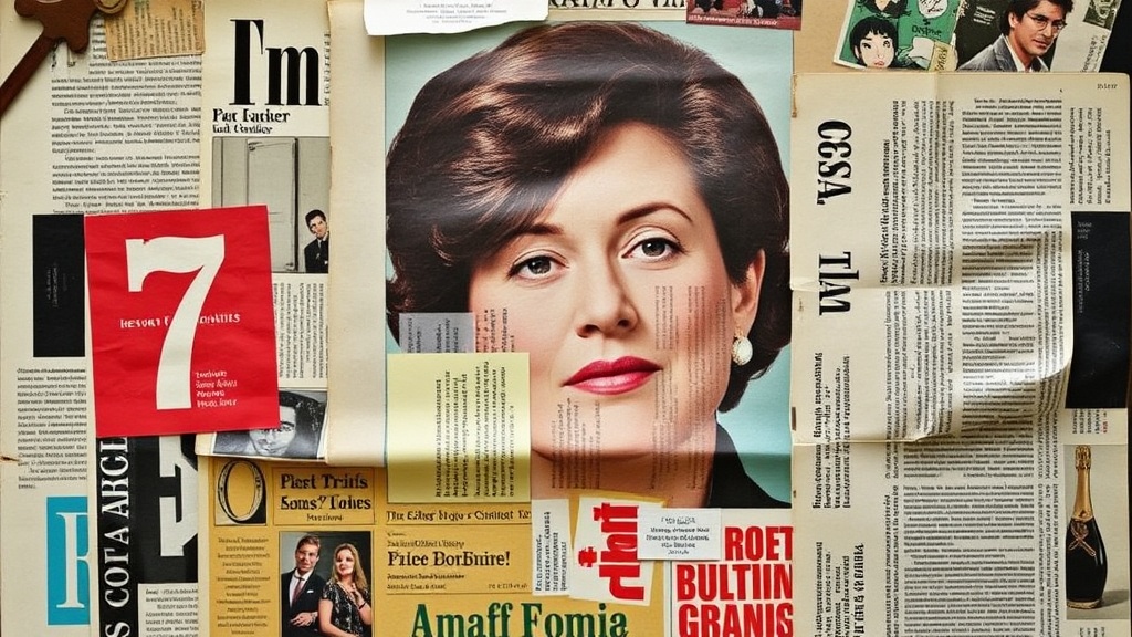
4. Deconstructing and Reassembling Imagery
If you find a specific image—a portrait, a landscape, or an object—that catches your eye, don't feel limited to using it as a whole. Deconstruction is a way to make the "found" imagery truly your own. By breaking an image apart, you move away from mere "pasting" and into the realm of true collage art.
Try cutting a person's eyes out of one magazine and placing them onto a botanical illustration from another. Or, take a landscape and replace the sky with a close-up of a piece of fabric or a textured architectural detail. This technique forces you to look at images as a collection of shapes, colors, and parts rather than finished products. It is a wonderful way to practice "ugly making," as the resulting surreal or nonsensical images take the pressure off of creating something "realistic."
5. Creating "Window" Effects with Cutouts
Instead of treating a magazine page as a surface to be glued down, treat it as a stencil or a frame. This is a more advanced technique that involves using the magazine to create "windows" into your artwork. You can achieve this by cutting a shape out of a thick piece of magazine cardstock (like a cover) and using it as a frame for a more delicate piece of art underneath.
For example, you could cut a large circle or a geometric shape out of a colorful magazine cover. Glue this "frame" onto your journal page, and then paint or draw within the empty space of the circle. This creates a sense of depth, as if the viewer is looking through a portal. You can also use the cutout as a stencil: place the magazine shape over your paper and use a sponge to dab acrylic paint around the edges, creating a soft, diffused border that mimics the shape of the cutout.
6. Developing Abstract Patterns with Repetitive Shapes
Magazines often feature repetitive patterns, whether they are architectural details like brickwork and tiling, or natural patterns like leaf veins and animal prints. These are incredibly useful for creating abstract patterns in your journals without having to draw them from scratch.
To use this technique, look for high-contrast patterns. A black-and-white geometric pattern can provide a sharp, modern edge to a messy, colorful page. A soft, organic pattern like a close-up of a flower petal can add a sense of movement. You can cut these patterns into small, uniform shapes—like circles, triangles, or strips—and repeat them across your page to create a rhythmic, patterned background. This is an excellent way to fill up "empty" space in a way that feels intentional rather than accidental.
7. Making "Found" Ephemera and Small Details
Sometimes, the best use for a magazine scrap is to turn it into a small, movable element. This is known as making "ephemera"—small pieces of art that can be tucked into journal pockets, taped in with washi tape, or used in a separate collage layout.
You can create your own custom ephemera by:
- Layering and Laminating: Glue a scrap of magazine text to a piece of heavy watercolor paper, then coat it with a layer of matte medium or clear gesso to give it a sturdy, "official" feel.
- Adding Distressing: Take a colorful magazine cutout and use sandpaper to gently rub away the edges, or use a dark ink pad to add "grime" to the corners. This makes the piece look like a vintage scrap rather than a fresh magazine clipping.
- Creating Tags: Cut magazine scraps into the shape of luggage tags or gift tags. Use these to write down a single word, a date, or a tiny piece of a thought, then tuck them into your journal.
The goal of using magazine collage is not to create a masterpiece that looks like it belongs in a gallery; it is to use these scraps to bridge the gap between your internal world and the physical page. When you use a piece of someone else's photography or typography, you are essentially "borrowing" a starting point so that you can eventually find your own voice. Embrace the mess, the torn edges, and the mismatched colors. That is where the real growth happens.