Making Peace with Messy Layers through Collage and Ink

Why Your Journal Needs Ugly Layers
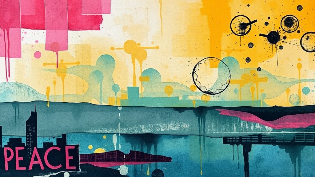
Imagine sitting down with a brand-new, pristine sketchbook page. The white space feels heavy—almost aggressive. You want to create something beautiful, but the fear of making a mistake keeps your pen hovering just an inch above the surface. This is where we start. Instead of trying to make a "pretty" painting, we're going to focus on the act of layering. We'll use torn scraps, ink splatters, and textured papers to build a foundation that doesn't care about being perfect. This process isn't about the final result; it's about the physical act of building up texture until the original white page is completely gone. When you focus on the mess, the pressure to be "good" starts to fade.
Layering is a way to practice being okay with imperfection. If a piece of paper goes on crooked, you just layer something else on top. If an ink blot lands where you didn't want it, you treat it like a new feature. This is a way to build a visual history of a moment, one scrap at a time.
How do I start a mixed media collage?
You don't need a plan to start a collage. In fact, having too much of a plan can actually stall your creativity. Grab some old book pages, junk mail, or even old grocery receipts. The goal here is to create a "base layer" that feels substantial. I like to use scraps that have a bit of weight to them—think old envelopes or thin cardstock.
- Step 1: Tearing instead of cutting. Use your hands to rip up your paper. The frayed, white edges of torn paper add a tactile, organic feel that scissors just can't replicate.
- Step2: The glue method. Use a glue stick or a thin layer of matte medium. Don't worry about being precise. A little bit of overlap between pieces creates depth.
- Step 3: Building the foundation. Lay down your largest pieces first, then layer smaller, more detailed scraps on top. This creates a sense of depth that makes the page feel three-dimensional.
If you're feeling stuck, look at the Museum of Modern Art archives for inspiration on abstract compositions. You aren't looking for a specific image to copy, but rather a way to see how different shapes and colors interact. You're just looking for a vibe.
Can I use ink over watercolor and collage?
Yes, and this is where the magic happens. Once your paper scraps are glued down and dry, you can introduce ink to define shapes or create controlled chaos. If you've used watercolors or even just water and food coloring, you've created a textured surface that is ready for ink.
One of my favorite ways to add movement is using a fine-liner pen or a brush pen. You might draw simple lines over your collage, or perhaps just little dots and dashes. The key is to let the ink interact with the textures you've already built. If your paper is slightly damp, the ink might bleed a little—embrace that! That's the "ugly" part that actually makes the piece interesting. If you want to learn more about the properties of different ink types, the Winsor & Newton website has wonderful technical breakdowns of how ink behaves on various surfaces.
Don't be afraid to go heavy-handed. If a line feels too thin, draw it again. If a shape feels too small, surround it with more ink. This is your playground, not a gallery piece. The more you play with the resistance of the paper and the flow of the ink, the more you'll realize that "mistakes" are just unexpected turns in the path.
How do I add texture without feeling overwhelmed?
Texture can feel intimidating if you try to do too much at once. Instead of trying to make the whole page textured, pick one small area to focus on. Maybe it's just a tiny corner. You might use a stencil or even just a crumpled piece of aluminum foil to press into some wet paint.
Here is a quick list of ways to add texture that don't require expensive tools:
- Salt: Sprinkle a tiny bit of table salt onto wet watercolor. It sucks up the pigment and creates a beautiful, crystalline texture.
- Scraping: Use an old credit card to scrape some wet paint or thick acrylic across the surface. It creates long, sweeping lines that look much more dynamic than a brush stroke.
- Stamping: You don't need professional stamps. A cut-up potato or even the bottom of a textured bottle can leave a unique print.
The more you allow yourself to be messy, the more you'll find that the "perfect" version of your art is actually the one that's a bit chaotic. We spend so much time trying to control our environments, but your journal is the one place where you can let go of the reins. Let the paint drip. Let the ink smudge. It's all part of the process of being human.
When you finish a page, don't immediately look for what's "wrong." Instead, look for what surprised you. Did that one piece of blue paper look better than you expected? Did the ink splatter create a shape that looks like a bird? Celebrate those little wins. Even an "ugly" page is a victory because you showed up and did the work. That is the real self-care part of this practice.