Forget Color Theory: How I Pick Colors by Feeling (and Why My Pages Are Better for It)

Forget Color Theory: How I Pick Colors by Feeling (and Why My Pages Are Better for It)
I took a color theory class in college. I learned about complementary pairs and split-complementary schemes and triadic harmonies. I passed the final with a B+.
And then I went home and kept picking colors the way I always had: by grabbing whatever tube felt right in the moment.
Here's my confession — I almost never think about color theory when I'm art journaling. Not because it isn't useful. It is, for certain things. But the second I start running my page through a "does this palette work according to the rules" filter, I freeze up. The page stops being mine and starts being homework.
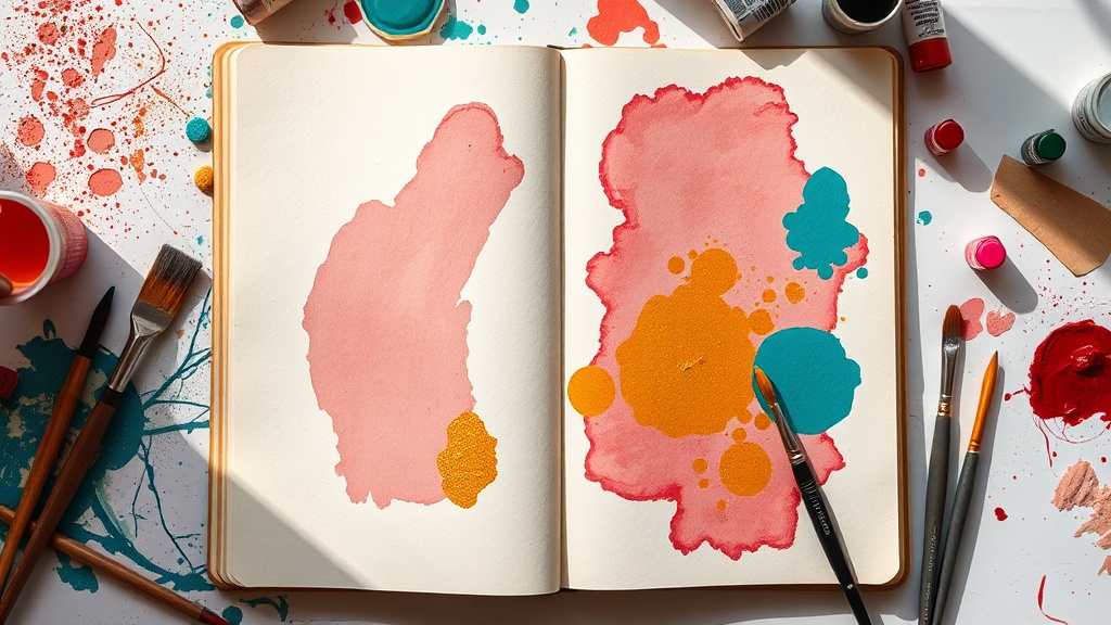
The mood grab
My actual process for picking colors is embarrassingly simple. I call it the mood grab.
I sit down. I look at all my paints, markers, whatever's out. And I reach for whatever my hand wants to touch first. That's it. That's the system.
Sometimes it's a dusty pink and a deep teal because I'm feeling soft but grounded. Sometimes it's black and neon orange because I'm irritated and restless. Last Thursday it was three shades of grey and one tiny dot of gold, because I was tired but still wanted something to feel precious about the day.
The colors I pick tell me more about my mood than my mood journal does. Honestly? They're more accurate than anything I could write in words.
Why rules make my pages worse
When I try to follow color rules, here's what happens:
- I second-guess every choice ("is burnt sienna warm enough to pair with this cerulean?")
- I spend ten minutes on a color wheel app instead of painting
- The page looks technically "correct" but feels flat and lifeless
- I don't enjoy the process, and it shows
Compare that to the mood grab:
- I start immediately
- The colors feel alive because they came from something real
- Even "ugly" combinations have energy
- I actually want to keep going
The worst pages in my journal are the ones where I tried to be strategic. The best ones are the ones where I trusted my gut and let the mess happen.
But what about when everything clashes?
Yeah, sometimes the mood grab gives me four colors that look like a toddler's birthday party gone wrong. That happens. Here's what I do:
- Add a neutral. One layer of white, cream, or kraft paper over part of the chaos calms everything down. It gives the loud colors room to breathe instead of screaming over each other.
- Let one color win. Pick whichever color you're drawn to most and add more of it. Let it dominate the page. The others become accents and suddenly the whole thing has a hierarchy.
- Outline in black. A black fine-liner or paint pen over the top unifies almost anything. It's like putting a frame around chaos — suddenly it looks intentional.
None of these are color theory tricks. They're just ways to let your intuitive choices stand while giving the page a little structure.
A tiny experiment to try tonight
Next time you sit down to journal, try this:
- Close your eyes for five seconds. Just breathe and notice how you feel.
- Open your eyes and grab the first three colors you're drawn to. Don't think. Just grab.
- Use only those three colors (plus one neutral if needed) for the whole page.
- When you're done, write one sentence at the bottom about how you were feeling when you started.
I've been doing this for about six months now and it's turned my journal into something weirdly revealing. I can flip back through pages and see exactly where I was emotionally without reading a single word. The magenta-and-black week was the fight with my landlord. The soft lavender stretch was when Sadie and I took that long weekend on the coast. The page that's entirely raw sienna with one aggressive streak of phthalo blue? I don't even remember writing anything on it, but I remember exactly how that Tuesday felt.
Your journal isn't a design project
Look, if color theory lights you up and makes your creative process more fun, keep using it. Genuinely. Some people love having a system.
But if you're someone who freezes in front of a blank page because you're worried about "getting the colors wrong" — there is no wrong. Your hand knows things your brain is still processing. Let it pick.
The whole point of art journaling, at least for me, is that it's the one place where I don't have to perform competence. I don't have to prove I learned something in a classroom. I just have to show up and make marks that feel true.
Messy palettes. Clashing hues. Colors that "shouldn't" go together but somehow do because you put them there and you meant it.
That's not bad art. That's honest art.
What colors are you reaching for this week? I'd love to see your mood grabs — tag me @artjournalblog or drop a comment below.