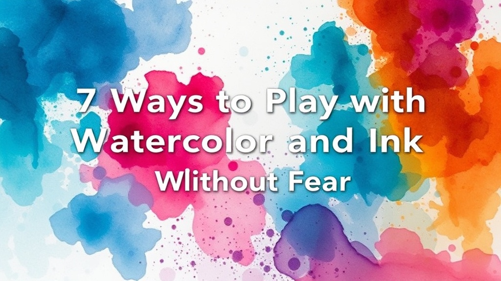
7 Ways to Play with Watercolor and Ink Without Fear

In this post, you'll learn how to stop overthinking your brushstrokes and start playing with the unpredictable relationship between water and ink. We're looking at ways to invite messiness into your art journal through controlled spills, ink bleeds, and texture-driven experimentation.
Most artists—especially those of us who struggle with perfectionism—treat the blank page like a high-stakes exam. We wait for the "perfect" moment to pick up the brush, but that moment rarely arrives. Instead, I want to show you how to treat your art journal as a playground where mistakes are actually the most interesting parts of the work. When you work with watercolor and ink, you're working with two very different temperaments. Watercolor wants to flow and bleed; ink wants to sit, stain, and define. When these two collide, something magic happens—if you let go of the need to control every drop.
Can I use any ink with watercolor?
The short answer is: it depends on if you want the ink to stay or move. If you're using a waterproof pigment ink (like those found in Winsor & Newton technical pens), the ink will sit firmly on top of your dried watercolor washes. This is great for adding detail or structure after you've played with color. However, if you're using a water-soluble ink or a fountain pen, the ink will bleed into the wet watercolor, creating those beautiful, organic blooms we love. This is where the real fun begins.
When you're starting out, don't worry about making a "painting." Aim for a "sketch of a feeling." Use a wet brush to lay down a puddle of color, then drop a bead of ink into the center. Watch how the ink fights the water. It's a beautiful, chaotic dance that doesn't require a plan.
How do I make textures with watercolor and ink?
Texture isn't just something you see; it's something you build through layering. If you want to add grit or depth to your journal pages, try these techniques:
- Salt and Ink: Lay down a heavy watercolor wash and, while it's still quite wet, sprinkle sea salt over the surface. Once it dries, brush the salt away to reveal crystalline textures. Then, go back in with a fine-liner pen to add tiny details around the textured spots.
- The Splatter Method: Grab an old toothbrush, dip it in highly pigmented ink, and flick it across your page. This creates a sense of movement and energy that a controlled brushstroke just can't mimic.
- Resist Techniques: Use a white wax crayon or a candle to draw shapes before you paint. The wax will repel the water, leaving ghostly white shapes in your colorful wash.
I often suggest trying these with low-grade paper first. Why? Because high-quality paper is expensive, and if you're afraid of "ruining" a $10 sheet of watercolor paper, you'll never truly play. Use the scraps. Use the cheap stuff. Let the ink bleed through the page—it's part of the charm.
What are the best tools for messy art journaling?
You don't need a professional studio to start. In fact, having too many tools can sometimes lead to more decision paralysis. To get started with a messy, ink-heavy practice, I recommend keeping a small kit of the following:
| Tool | Why it's great for messy play |
|---|---|
| Water-soluble fine liners | Creates instant blooms and bleeding effects in wet paint. |
| Graphite Pencils | Perfect for adding soft, hazy shadows that feel more organic than ink. |
| Stippling Brushes | Great for adding tiny, controlled dots of texture. |
| Found Objects (Sponges/Twigs) | Adds unexpected, non-uniform textures to your layers. |
One of my favorite ways to add texture is by using a piece of crumpled plastic wrap. Lay a wet watercolor wash down, press the plastic on top, and lift it up. It leaves behind a crackled, organic pattern that looks like stone or dried earth. It's a way to create something complex without needing any technical drawing skills.
Embracing the "Ugly" Stage
Every piece of art goes through an ugly phase. When you're working with ink and watercolor, the middle stage—where everything looks like a muddy, illegible blob—can be incredibly frustrating. This is usually where people quit. But this is where the real work happens. If the page looks messy, you're doing it right. You're pushing past the surface-level prettiness to find something deeper.
If you feel yourself getting frustrated, stop. Put the pen down. Walk away. The ink will dry, and the watercolor will settle. Often, a design that looked like a disaster while wet becomes a stunning, textured layer once it's fully dry. This is a great metaphor for life, isn't it? Most of the best things are still in progress.
Try experimenting with different ink weights. A heavy, dark ink line can act as an anchor for a very light, ethereal watercolor wash. Or, try the opposite: a light, watery ink wash with heavy, dark, permanent ink details. This contrast creates a sense of depth that makes your journal pages feel alive. Don't be afraid to get your hands a little dirty—that's where the soul of the work lives.